A person sitting with a laptop, glancing at their phone - an everyday online moment
Concordium

Privacy you can feel.

Designing Concordium's ID app so ordinary people trust it: proving who they are online while giving away nothing more than the moment needs.

At a glance

Project
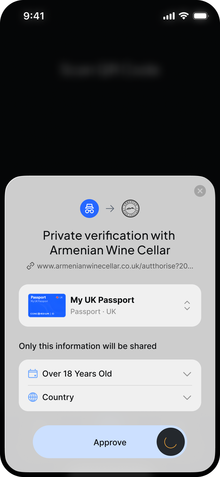
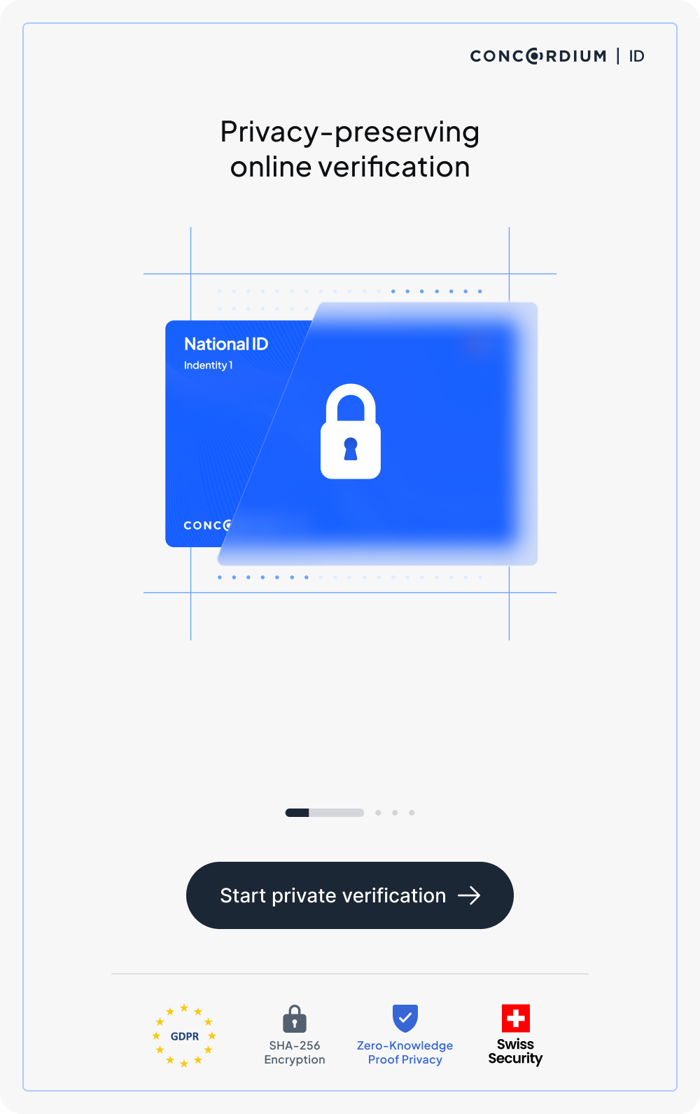
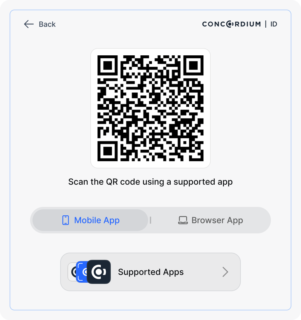
Concordium ID: privacy-preserving online identity verification
My role
Design Lead: ran the design department, guiding several designers across all design work
Scope
Early concept → launch (0 → 1)
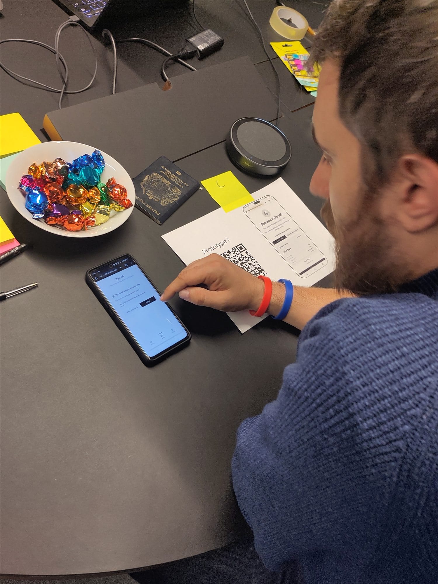
Research
London · non-technical people, not crypto
Built with
AI-made prototypes, tested then shipped
The challenge
Make a provably private app feel private, and trustworthy
Outcome
Launched to the community, and growing since
A person focused on a laptop at home - the kind of everyday user who has to trust an online identity check
The people who'd use it: ordinary, non-technical, online.

The brief

The maths was private. The feeling had to be designed.

The app can prove a fact about you, over 18, a citizen, a real person, while revealing nothing else, provably. But provable is not believable. Feeling private is bound up with trust, and trust is easily lost.

The real questionNot “is it private?” but “will people believe it is?”

A participant in a London research session testing the prototype on a phone, with a printed prototype sheet, a QR code and a UK passport on the table
Testing the prototype with ordinary people in London: passports, not wallets.

The research

Built with AI in days, tested with real people the same week.

I built the prototypes fast with AI, then took them to London, to non-technical people who owed the claim nothing, and watched them try to prove who they were.

The approval screen: a request from a wine shop showing 'Only this information will be shared - Over 18 Years Old, Country', above an Approve button
Before you approve, you see exactly what leaves your hands.

What we learned · 1

Privacy you can see beats privacy you're promised.

People don't weigh a privacy claim. They watch what the app does. So the screen shows exactly what's shared, and nothing else.

The verification landing screen: 'Privacy-preserving online verification' above an ID card sealed with a padlock
A promise in plain language, and a picture you don't need a glossary for.

What we learned · 2

Explaining “zero-knowledge proofs” spent trust, not built it.

An unfamiliar term reads as something to take on faith, the opposite of feeling shown. So we showed instead: a plain promise and a simple visual.

The verification start screen: a QR code to scan with a supported mobile or browser app to begin a private verification
A proof always begins in someone else's context: a checkout, a sign-up, an age gate.

What we learned · 3

What feels appropriate is set by the moment, not the feature.

The same disclosure felt safe in one context and intrusive in another. So each proving moment asks only for what it genuinely warrants.

What happened

0 → 1

from early concept to a launched app the community keeps using.

Once the prototypes had earned their answers, I led the design team in turning them into the real product, holding the line on the research the whole way: privacy felt, shown rather than asserted, and tuned to each moment. It shipped to the community by the end of the year, and has been growing ever since.

The hard partNot shipping. Holding the line on “show, don't assert” all the way through the build.

Looking back

What I'd carry forward

My first instinct was to explain the mechanism. Surely if people understood zero-knowledge proofs, they'd trust it. They didn't; explaining quietly cost trust. Some early AI mockups had the opposite flaw: privacy that read beautifully in a demo but skipped the moment someone actually decides to believe it.

Both got fixed by testing with people who owed the claim nothing. Next time I'd trust “show, don't tell” from the start.

← Back to all work